Looks vs Results
Making things look nice can take a long time, either due to lack of resources or abundance of opinions. This could delay launches, frustrate people, and waste precious energy. Those are high costs for startups or companies hoping to move fast.
Is it worth it?
Long ago I got fed up with delaying marketing campaigns because an email had to look nice. I tested styled versus unstyled emails and found that making emails look nice was not worth it.
After years of repeating some form of that test, and generally noticing that simplistic and rough-around-the-edges designs don’t seem to affect outcomes of enterprise software companies, I developed a bias towards simplicity and shipping things before they look nice.
From time to time I like to test my assumptions. Maybe looking nice matters more now than before, or maybe the effects I saw only applied to email, or maybe I’m just looking for reasons to do less work?
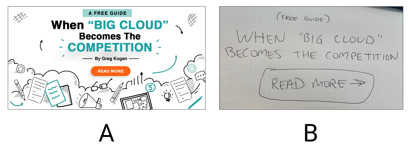
For the latest experiment I ran two ads on LinkedIn, targeting executives at enterprise software companies, to see which of them got more clicks. One ad looked nice (or nice enough), like something a marketing team would spend a couple of hours to discuss and produce. The other ad looked like, well…

One is a beautiful work of art, the other is Option A and took $148 plus a few days of waiting.
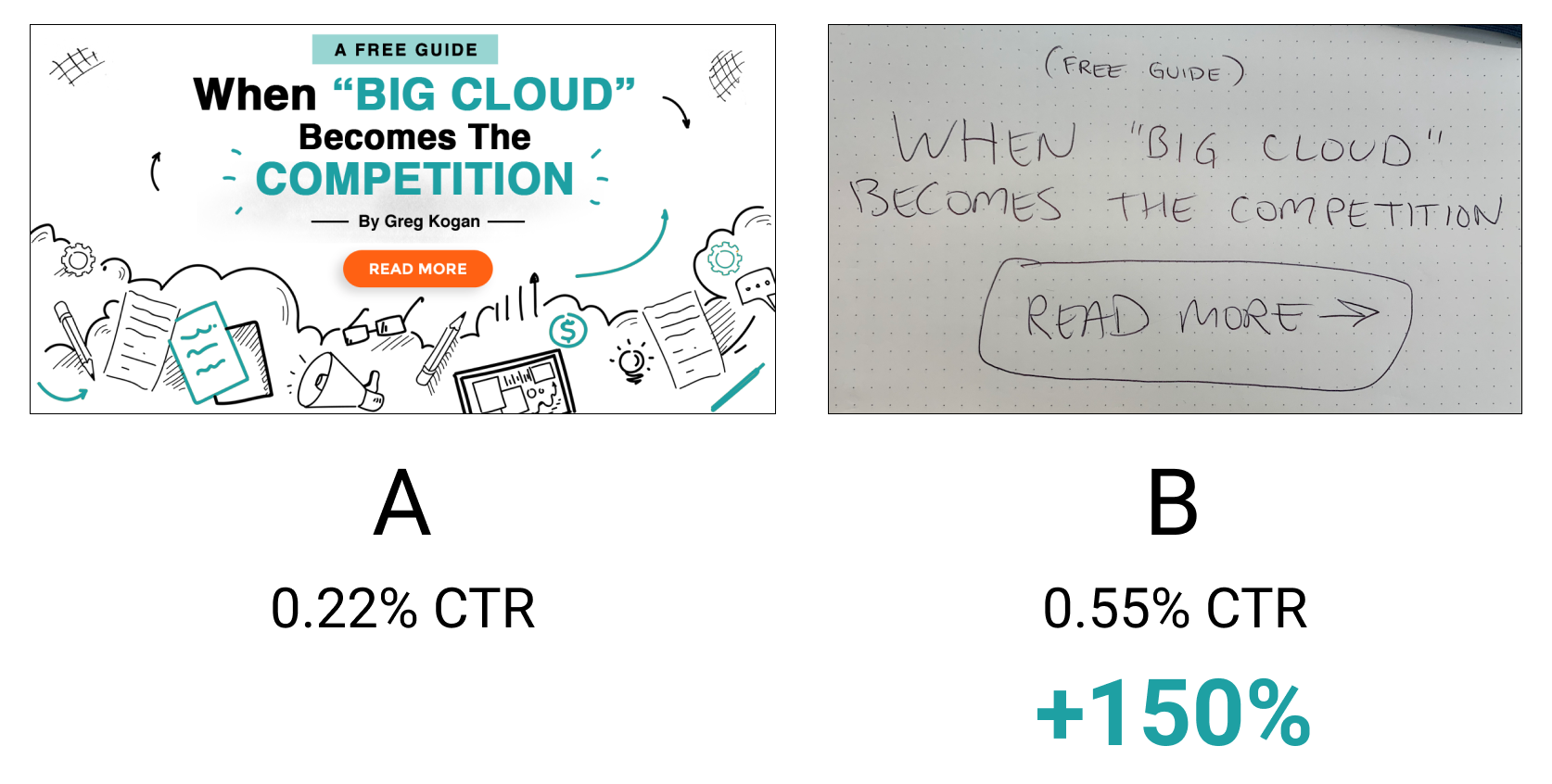
Let’s see how they performed:


An ad that took me 15 seconds to create had a 2.5x better clickthrough rate than one done by a paid designer. If this were an actual campaign it would mean 2.5x more sales leads or user signups at a lower acquisition cost, on top of shipping faster with less overhead.
From time to time we need a reminder about what’s worth the effort, and what isn’t.


